Just How Bad is the Recession?
 Paul Krugman has argued that the current recession is worse than the economic downturns of the 70s and 80s. But do his claims hold up?
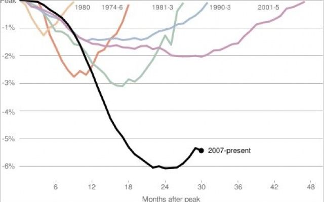
I keep seeing that chart that shows how employment declines in the current recession are so much worse than in past ones. You know, this one:
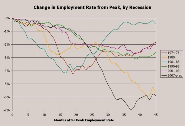
On many dimensions, of course, the current recession is much worse, but this chart has always seemed funny to me. And after reading Paul Krugman mock the idea that the recessions of the 1970s and 1980s were at all comparable, I decided to make my own damn chart. Because the above chart looks at employment levels, which are affected by labor force growth, I decided to look at employment rates instead (subtracting the unemployment rate for each month from 100). Because the composition of the labor force has also changed over time (lots more married women, most notably), I decided to confine to white men ages 20 and up. And because it's unclear to me what "peak" is used in this chart (see the vague note at the bottom of Rampell's chart) and since the relationship of the NBER business cycle peak to the unemployment rate involves a lag, I decided to measure from the peak employment level. Got all that? Here's my chart:
I've labeled the lines the same way that Rampell's chart is labeled, by the recessions that followed each employment rate peak. The figures are from BLS and are based on their seasonally adjusted series.
This approach makes clear why people were disappointed by the "jobless" recoveries from the recessions of the early 1990s and 2000s, which were no faster than after the much more severe recession of the early 1970s (though of course, the declines in employment were much smaller to begin with). More to the point, it also shows that while the current recession still looks bad, bad, bad, the decline in employment is comparable to the decline during the double-dip recession, which is apparent from the "1980" line. That's not the most fantastic news of course, but it's worth noting. Unfortunately, I doubt this is the chart you'll see others use and update as things evolve in the next few months.
Originally published at The Empiricist Strikes Back.


