Income Inequality: It's a Global Thing
 For all the concern over income inequality, is America's experience really that different than the rest of the modern world?
Yet again and again [economists and other researchers not named Hacker or Pierson] have found themselves at dead ends or have missed crucial evidence. After countless arrests and interrogations, the demise of broad-based prosperity remains a frustratingly open case, unresolved even as the list of victims grows longer.
All this, we are convinced, is because a crucial suspect has largely escaped careful scrutiny: American politics.
– Jacob Hacker and Paul Pierson, Winner Take All Politics
Researchers and economists often look closely at American politics to develop theories to explain purported income disparities. Yet, for all the growing concern over income inequality and all of the theories, a close look at the data shows that America's experience with inequality is consistent with the rest of the modern world.
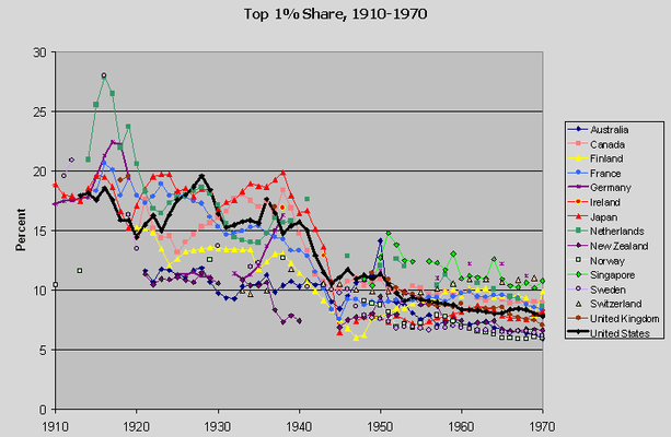
Here's a chart showing trends in the share of income received by the top one percent for all the modern industrialized nations for which data is available going back to the early twentieth century:

The data is from a new website created by several of the leading scholars studying inequality with tax data. The American trend, the thick black line, is from the much cited work of Thomas Piketty and Emmanuel Saez, which is part of this new database.
From 1910 to 1970, American inequality trends follow the broad international pattern, and inequality levels are in the middle of the pack. That's basically still true from 1970 to 1986:

It's rising a bit over the period, but only by a percentage point. Note I'm keeping the scale of the charts the same for each one. Here's the chart for 1988 to 2006:

Uh-oh. Now we look like our inequality levels are higher than everywhere else. What happened? 1986 to 1988 happened, as is evident from the 1970-2006 trend:

Wow, that's a four percentage point increase in two years—three times the increase over the 16 years from 1970 to 1986, and bigger than the 12-year increase from 1988 to 2000. Huh. There are two possibilities here. One is that the data is right. You can see where I'm going here.
It helps to know that the 1986 tax reform created big incentives for people who had previously reported income on corporate returns (where it is invisible to the datasets above) to report on individual income tax returns (where it appears as an out-of-the-blue increase). And if this may be considered a permanent change in the tax regime, then the effect is for more income to show up on individual returns after 1986 than before, artificially lifting the top income share in every subsequent year.
Hmmm... which possibility is more likely? Let's look at another chart showing the trends just for the northern hemisphere Anglophone countries, to which I'll add a new line:

OK, from about 1940 to 1986, these trends line up strikingly, then the U.S. trend goes AWOL. However, let's instead assume the post-1986 U.S. trend is an artifact of the 1986 tax reform. First, let's increase the top one percent share from 1986 to 1988 by the same rate that it increased in the U.K. Then let's let the top share in the U.S. increase by the same rate that it actually did from 1988 to 2006, but from the new, lower 1988 level. The result is the revised line above. This makes the U.S. trend and level consistent with not just the U.K., but Canada.
Of course, if the 1988 to 2006 top share levels are more accurate in the U.S. after 1988 than before 1986, then rather than lowering the post-1986 trend, we should raise the pre-1988 trend. That would make U.S. levels uniformly higher than in the U.K. and Canada. But of course, the measured U.K. and Canadian top share levels may also be artificially low due to tax avoidance. And of course, the common trend over the three countries would remain.
So, to review, when the post-1986 U.S. trend is corrected, the U.S. experience with inequality over the past 100 years is broadly consistent with the rest of the modern world. Here's the summary chart for 1910-2006, with the revised U.S. trend.

Comparing levels is more difficult, but many recent cross-national comparisons related to inequality are about why trends differ. What these five charts clarify is that explanations for the recent rise in American inequality that focus on uniquely American causes—such as greater political muscle-flexing among corporations and the mega-rich—are insufficient (and unnecessary).
Update: I've received several responses offline that it's going too far to say the experience of the U.S. is like that "everywhere else" and that it is really only like the other Anglophone countries. To some extent, that's a fair criticism. But of 15 countries shown here, only Germany, the Netherlands, and Switzerland haven't experienced an increase in inequality since 1980. And the increases in Norway and Finland are big as or bigger than in the U.S., U.K., and Canada. Sweden's increase is also nearly as great in relative terms (starting from a much lower level, of course). But even if this is a story about the U.S., U.K., and Canada or the Anglophone countries versus the rest of the world, that's still a problem for Hacker's and Pierson's U.S.-centric theory.
Originally published at The Empiricist Strikes Back.
Tweet