Downwardly Mobile America

James Pethokoukis has posted a new chart on his blog as part of his ongoing commentary about income inequality in America. In this post, he argues that “alarmists” are wrong to worry about income inequality because America has a lot of upward economic mobility:
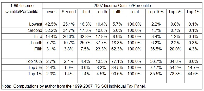
Turns out that the Tax Foundation has also looked at the economic mobility issue. Using IRS data, it found that about 60 percent of households that were in the lowest income quintile in 1999 were in a higher quintile in 2007.About 40 percent of households in the top quintile moved to a lower quintile over this 9 year period.
This echoes a comment Rep. Paul Ryan made in his address to the Heritage Foundation:
The Treasury Department’s latest study on income mobility in America found that during the ten-year period starting in 1996, roughly half of the taxpayers who started in the bottom 20 percent had moved up to a higher income group by 2005.
So lets take a closer look at some of this data.

As I look at this chart, I wonder if the data really creates a picture as optimistic its advocates suggest.
There are some data points which I hope are not indicative are downward mobility. At the 2nd quintile of income in 1997, 32% fell to a lower quintile in 2007. At the 3rd quintile, 40% fell into a lower quintile by 2007.
Now at the highest quintile, 37% did fall to a lower quintile, but most of that fall was to the quintile right below it, so still fairly high up. 62% of those in the highest quintile stayed there. Some might consider that to be fairly static but Pethokoukis cites the fact that "40 percent of households in the top quintile moved to a lower quintile over this 9 year period" as a positive sign, so maybe it depends on what amount of movement you consider to be a sign of mobility.
What I would be curious to see, in addition to changes in quintiles, would be changes in income between 1999 and 2007. It wouldn’t be such a problem if the households that there were falling into lower quintiles were getting richer as the economy grows, but are they? This data doesn't say.
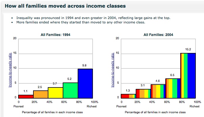
Thankfully, the Federal Reserve Bank of Boston did a similar study. They looked at a set of family income data which covered a similarly wide span of time (from 1994 to 2004).
As an added benefit, the data is also presented with dynamic graphics!

Here are some of their conclusions:
-40% of families were in the same income class in 2004 as in 1994, and only 22% moved up or down by more than one class.
-Over half (54%) of families who started in the poorest income class in 1994 were in the poorest income class in 2004; only 5% of these families made it to the richest income class.
-Inequality was pronounced during the decade. In 1994 the average family in the richest income class had an income‐to‐needs ratio 9 times as high as that of the average family in the poorest class, while in 2004 the richest family had income more than 11 times that of the poorest family, on average.
-Although families who started in the middle three income classes were more likely to move than those who began at the top or bottom—partly because only families in the middle three income classes are able to move both up and down— they were still more likely to end in the income class where they started than in any other income class.
The Boston Fed study goes further than the Tax Foundation study by comparing white and black income mobility. Their analysis of the racial differences is unambiguously sobering:
Downward mobility dominates among black families: 42 percent of black families who could move down (those not already in the poorest income class) did move down.
To be sure, this is a different data set covering a different time frame, but it would probably be worthwhile for the Tax Foundation and other groups to consider some of the questions that this data tried to answer: How do changes in income quintiles relate to relative wealth? What are the differences between different racial groups?
Simply identifying that people are moving along income brackets, as some conservatives are currently doing, is probably not sufficient. Mobility, upwards or downwards, does not provide a complete picture.
One last point, both the studies from the Tax Foundation and the Boston Fed used data from before the recent economic crisis. Does anyone expect that data which looked at the last four years would have any better news?
In fact, shouldn’t conservatives really be trying to find ways to look at whether the ‘Obama Economy’ has exacerbated income inequality? Wouldn’t they want to blame that on him?

